
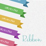
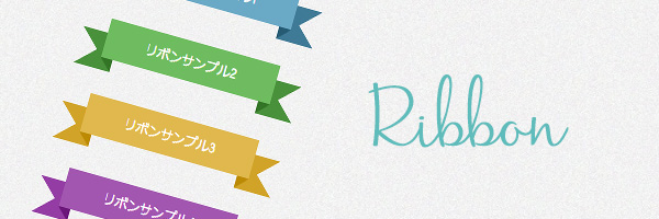
前記事に引き続きCSSのTipsになります。
今回も可愛らしい装飾をCSSで描いていきたいと思います。装飾の定番とも言える「リボン」をWebサイト上で使いたい時に試してみてください。
HTMLを記述
サンプルのHTMLは以下のようになっています。
|
1 2 3 4 5 6 7 8 9 10 11 12 13 14 15 16 17 18 19 |
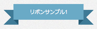
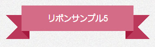
<div class="ribbon_1"> <p class="ribbon-content_1">リボンサンプル1</p> </div> <div class="ribbon_2"> <p class="ribbon-content_2">リボンサンプル2</p> </div> <div class="ribbon_3"> <p class="ribbon-content_3">リボンサンプル3</p> </div> <div class="ribbon_4"> <p class="ribbon-content_4">リボンサンプル4</p> </div> <div class="ribbon_5"> <p class="ribbon-content_5">リボンサンプル5</p> </div> |
Sample1
CSS
|
1 2 3 4 5 6 7 8 9 10 11 12 13 14 15 16 17 18 19 20 21 22 23 24 25 26 27 28 29 30 31 32 33 34 35 36 37 38 39 40 41 42 43 44 45 |
/* リボンサンプル1 */ .ribbon_1 { font-size: 16px !important; width: 50%; position: relative; background: #6aa9c6; color: #fff; text-align: center; padding: 1em 2em; margin: 2em auto 3em; } .ribbon_1:before, .ribbon_1:after { content: ""; position: absolute; display: block; bottom: -1em; border: 1.5em solid #3f7a96; z-index: -1; } .ribbon_1:before { left: -2em; border-right-width: 1.5em; border-left-color: transparent; } .ribbon_1:after { right: -2em; border-left-width: 1.5em; border-right-color: transparent; } .ribbon_1 .ribbon-content_1:before, .ribbon_1 .ribbon-content_1:after { content: ""; position: absolute; display: block; border-style: solid; border-color: #265b74 transparent transparent transparent; bottom: -1em; } .ribbon_1 .ribbon-content_1:before { left: 0; border-width: 1em 0 0 1em; } .ribbon_1 .ribbon-content_1:after { right: 0; border-width: 1em 1em 0 0; } |
Sample2

CSS
|
1 2 3 4 5 6 7 8 9 10 11 12 13 14 15 16 17 18 19 20 21 22 23 24 25 26 27 28 29 30 31 32 33 34 35 36 37 38 39 40 41 42 43 44 45 |
/* リボンサンプル2 */ .ribbon_2 { font-size: 16px !important; width: 50%; position: relative; background: #6ebc5f; color: #fff; text-align: center; padding: 1em 2em; margin: 2em auto 3em; } .ribbon_2:before, .ribbon_2:after { content: ""; position: absolute; display: block; bottom: -1em; border: 1.5em solid #49913b; z-index: -1; } .ribbon_2:before { left: -2em; border-right-width: 1.5em; border-left-color: transparent; } .ribbon_2:after { right: -2em; border-left-width: 1.5em; border-right-color: transparent; } .ribbon_2 .ribbon-content_2:before, .ribbon_2 .ribbon-content_2:after { content: ""; position: absolute; display: block; border-style: solid; border-color: #337426 transparent transparent transparent; bottom: -1em; } .ribbon_2 .ribbon-content_2:before { left: 0; border-width: 1em 0 0 1em; } .ribbon_2 .ribbon-content_2:after { right: 0; border-width: 1em 1em 0 0; } |
Sample3

CSS
|
1 2 3 4 5 6 7 8 9 10 11 12 13 14 15 16 17 18 19 20 21 22 23 24 25 26 27 28 29 30 31 32 33 34 35 36 37 38 39 40 41 42 43 44 45 |
/* リボンサンプル3 */ .ribbon_3 { font-size: 16px !important; width: 50%; position: relative; background: #e0b84d; color: #fff; text-align: center; padding: 1em 2em; margin: 2em auto 3em; } .ribbon_3:before, .ribbon_3:after { content: ""; position: absolute; display: block; bottom: -1em; border: 1.5em solid #d1a328; z-index: -1; } .ribbon_3:before { left: -2em; border-right-width: 1.5em; border-left-color: transparent; } .ribbon_3:after { right: -2em; border-left-width: 1.5em; border-right-color: transparent; } .ribbon_3 .ribbon-content_3:before, .ribbon_3 .ribbon-content_3:after { content: ""; position: absolute; display: block; border-style: solid; border-color: #bc8a03 transparent transparent transparent; bottom: -1em; } .ribbon_3 .ribbon-content_3:before { left: 0; border-width: 1em 0 0 1em; } .ribbon_3 .ribbon-content_3:after { right: 0; border-width: 1em 1em 0 0; } |
Sample4

CSS
|
1 2 3 4 5 6 7 8 9 10 11 12 13 14 15 16 17 18 19 20 21 22 23 24 25 26 27 28 29 30 31 32 33 34 35 36 37 38 39 40 41 42 43 44 45 |
/* リボンサンプル4 */ .ribbon_4 { font-size: 16px !important; width: 50%; position: relative; background: #a256b0; color: #fff; text-align: center; padding: 1em 2em; margin: 2em auto 3em; } .ribbon_4:before, .ribbon_4:after { content: ""; position: absolute; display: block; bottom: -1em; border: 1.5em solid #943ca4; z-index: -1; } .ribbon_4:before { left: -2em; border-right-width: 1.5em; border-left-color: transparent; } .ribbon_4:after { right: -2em; border-left-width: 1.5em; border-right-color: transparent; } .ribbon_4 .ribbon-content_4:before, .ribbon_4 .ribbon-content_4:after { content: ""; position: absolute; display: block; border-style: solid; border-color: #6b167a transparent transparent transparent; bottom: -1em; } .ribbon_4 .ribbon-content_4:before { left: 0; border-width: 1em 0 0 1em; } .ribbon_4 .ribbon-content_4:after { right: 0; border-width: 1em 1em 0 0; } |
Sample5
CSS
|
1 2 3 4 5 6 7 8 9 10 11 12 13 14 15 16 17 18 19 20 21 22 23 24 25 26 27 28 29 30 31 32 33 34 35 36 37 38 39 40 41 42 43 44 45 |
/* リボンサンプル5 */ .ribbon_5 { font-size: 16px !important; width: 50%; position: relative; background: #d46c87; color: #fff; text-align: center; padding: 1em 2em; margin: 2em auto 3em; } .ribbon_5:before, .ribbon_5:after { content: ""; position: absolute; display: block; bottom: -1em; border: 1.5em solid #bb395b; z-index: -1; } .ribbon_5:before { left: -2em; border-right-width: 1.5em; border-left-color: transparent; } .ribbon_5:after { right: -2em; border-left-width: 1.5em; border-right-color: transparent; } .ribbon_5 .ribbon-content_5:before, .ribbon_5 .ribbon-content_5:after { content: ""; position: absolute; display: block; border-style: solid; border-color: #a6193e transparent transparent transparent; bottom: -1em; } .ribbon_5 .ribbon-content_5:before { left: 0; border-width: 1em 0 0 1em; } .ribbon_5 .ribbon-content_5:after { right: 0; border-width: 1em 1em 0 0; } |
サンプルは「font-sizeが16px」、横幅が「50%」の設定になっていますので、サイズを変更したい場合は適宜調整してお使いください。