
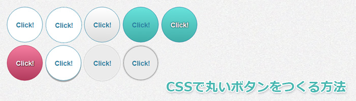
CSSの「border-radiusプロパティ」を使用して、色々な丸いボタンを作ってみたいと思います。まずはデモサンプルを確認してみてください。
単色ボタン

HTML
|
1 |
<p><a class="btn_a" href="#">Click!</a></p> |
CSS
|
1 2 3 4 5 6 7 8 9 10 11 12 13 14 15 16 17 18 19 20 21 22 |
.btn_a { width: 60px; height: 38px; background: #FFF; border: 1px solid #2a82a3; border-radius: 70px; -moz-border-radius: 70px; -webkit-border-radius: 70px; color: #2a82a3; padding: 42px 20px 20px; display: block; text-align: center; font-weight: bold; font-size: 120%; transition: background-color 0.5s ease-in; -webkit-transition: background-color 0.5s ease-in; } .btn_a:hover { background: #2a82a3; color: #FFF; border: 1px solid #FFF; } |
枠線点線ボタン

HTML
|
1 |
<p><a class="btn_b" href="#">Click!</a></p> |
CSS
|
1 2 3 4 5 6 7 8 9 10 11 12 13 14 15 16 17 18 19 20 21 22 |
.btn_b { width: 60px; height: 38px; background: #FFF; border: 2px dotted #2a82a3; border-radius: 70px; -moz-border-radius: 70px; -webkit-border-radius: 70px; color: #2a82a3; padding: 42px 20px 20px; display: block; text-align: center; font-weight: bold; font-size: 120%; transition: background-color 0.5s ease-in; -webkit-transition: background-color 0.5s ease-in; } .btn_b:hover { background: #2a82a3; color: #FFF; border: 2px dotted #FFF; } |
グラデーションボタン

HTML
|
1 |
<p><a class="btn_c" href="#">Click!</a></p> |
CSS
|
1 2 3 4 5 6 7 8 9 10 11 12 13 14 15 16 17 18 19 20 21 22 23 24 |
.btn_c { width: 60px; height: 38px; background: #FFF; background: -moz-linear-gradient(top,#FFF 0%,#DDD); background: -webkit-gradient(linear, left top, left bottom, from(#FFF), to(#DDD)); border: 1px solid #2a82a3; border-radius: 70px; -moz-border-radius: 70px; -webkit-border-radius: 70px; color: #2a82a3; padding: 42px 20px 20px; display: block; text-align: center; font-weight: bold; font-size: 120%; transition: background-color 0.5s ease-in; -webkit-transition: background-color 0.5s ease-in; } .btn_c:hover { background: #2a82a3; color: #FFF; border: 1px solid #FFF; } |
グラデーションボタン(色付き)

HTML
|
1 |
<p><a class="btn_d" href="#">Click!</a></p> |
CSS
|
1 2 3 4 5 6 7 8 9 10 11 12 13 14 15 16 17 18 19 20 21 22 23 24 |
.btn_d { width: 60px; height: 38px; background: #FFF; background: -moz-linear-gradient(top,#68e2db 0%,#41aea8); background: -webkit-gradient(linear, left top, left bottom, from(#68e2db), to(#41aea8)); border: 1px solid #2a82a3; border-radius: 70px; -moz-border-radius: 70px; -webkit-border-radius: 70px; color: #2a82a3; padding: 42px 20px 20px; display: block; text-align: center; font-weight: bold; font-size: 120%; transition: background-color 0.5s ease-in; -webkit-transition: background-color 0.5s ease-in; } .btn_d:hover { background: #2a82a3; color: #FFF; border: 1px solid #FFF; } |
グラデーションボタン1(色付き/テキスト影付き)

HTML
|
1 |
<p><a class="btn_e" href="#">Click!</a></p> |
CSS
|
1 2 3 4 5 6 7 8 9 10 11 12 13 14 15 16 17 18 19 20 21 22 23 24 25 |
.btn_e { width: 60px; height: 38px; background: #FFF; background: -moz-linear-gradient(top,#68e2db 0%,#41aea8); background: -webkit-gradient(linear, left top, left bottom, from(#68e2db), to(#41aea8)); border: 1px solid #2a82a3; border-radius: 70px; -moz-border-radius: 70px; -webkit-border-radius: 70px; color: #FFF; padding: 42px 20px 20px; display: block; text-align: center; font-weight: bold; font-size: 120%; text-shadow: 0px 0px 5px rgba(0,0,0,1); transition: background-color 0.5s ease-in; -webkit-transition: background-color 0.5s ease-in; } .btn_e:hover { background: #2a82a3; color: #FFF; border: 1px solid #FFF; } |
グラデーションボタン2(色付き/テキスト影付き)

HTML
|
1 |
<p><a class="btn_f" href="#">Click!</a></p> |
CSS
|
1 2 3 4 5 6 7 8 9 10 11 12 13 14 15 16 17 18 19 20 21 22 23 24 25 |
.btn_f { width: 60px; height: 38px; background: #FFF; background: -moz-linear-gradient(top,#f47c9e 0%,#b23b5d); background: -webkit-gradient(linear, left top, left bottom, from(#f47c9e), to(#b23b5d)); border: 1px solid #b23b5d; border-radius: 70px; -moz-border-radius: 70px; -webkit-border-radius: 70px; color: #FFF; padding: 42px 20px 20px; display: block; text-align: center; font-weight: bold; font-size: 120%; text-shadow: 1px 1px 3px rgba(0,0,0,1); transition: background-color 0.5s ease-in; -webkit-transition: background-color 0.5s ease-in; } .btn_f:hover { background: #b23b5d; color: #FFF; border: 1px solid #FFF; } |

単色ボタン(凹み)

HTML
|
1 |
<p><a class="btn_g" href="#">Click!</a></p> |
CSS
|
1 2 3 4 5 6 7 8 9 10 11 12 13 14 15 16 17 18 19 20 21 22 23 24 25 26 27 28 |
.btn_g { width: 60px; height: 38px; background: #FFF; border: 1px solid #2a82a3; border-radius: 70px; -moz-border-radius: 70px; -webkit-border-radius: 70px; color: #2a82a3; padding: 42px 20px 20px; display: block; text-align: center; font-weight: bold; font-size: 120%; box-shadow: 0px 4px 0px rgba(000,000,000,0.3); -moz-box-shadow: 0px 4px 0px rgba(000,000,000,0.3); -webkit-box-shadow: 0px 4px 0px rgba(000,000,000,0.3); transition: background-color 0.5s ease-in; -webkit-transition: background-color 0.5s ease-in; } .btn_g:hover { background: #2a82a3; color: #FFF; box-shadow: none; margin-top: 10px; position: relative; top: 3px; } |
単色ボタン(うっすら凸)

HTML
|
1 |
<p><a class="btn_h" href="#">Click!</a></p> |
CSS
|
1 2 3 4 5 6 7 8 9 10 11 12 13 14 15 16 17 18 19 20 21 22 23 24 |
.btn_h { width: 60px; height: 38px; background: #ebebeb; border: 1px solid #FFF; border-radius: 70px; -moz-border-radius: 70px; -webkit-border-radius: 70px; color: #2a82a3; padding: 42px 20px 20px; display: block; text-align: center; font-weight: bold; font-size: 120%; box-shadow: 0px 0px 5px rgba(000,000,000,0.3); -moz-box-shadow: 0px 0px 5px rgba(000,000,000,0.3); -webkit-box-shadow: 0px 0px 5px rgba(000,000,000,0.3); transition: background-color 0.5s ease-in; -webkit-transition: background-color 0.5s ease-in; } .btn_h:hover { background: #2a82a3; color: #FFF; } |
単色ボタン(濃い凹み)

HTML
|
1 |
<p><a class="btn_i" href="#">Click!</a></p> |
CSS
|
1 2 3 4 5 6 7 8 9 10 11 12 13 14 15 16 17 18 19 20 21 22 23 24 |
.btn_i { width: 60px; height: 38px; background: #ebebeb; border: 1px solid #FFF; border-radius: 70px; -moz-border-radius: 70px; -webkit-border-radius: 70px; color: #2a82a3; padding: 42px 20px 20px; display: block; text-align: center; font-weight: bold; font-size: 120%; box-shadow: 0px 0px 2px rgba(000,000,000,0.3),inset 0px 0px 5px rgba(000,000,000,1); b-moz-box-shadow: 0px 0px 2px rgba(000,000,000,0.3),inset 0px 0px 5px rgba(000,000,000,1); -webkit-box-shadow: 0px 0px 2px rgba(000,000,000,0.3),inset 0px 0px 5px rgba(000,000,000,1); transition: background-color 0.5s ease-in; -webkit-transition: background-color 0.5s ease-in; } .btn_i:hover { background: #2a82a3; color: #FFF; } |