


要領の大きい画像などを配置したページを読み込む際に、ローディング表示をするだけで読み込み時間のユーザーストレスを軽減することができます。そこで「pace」を使用すると間単にプログレスバーなどの表示が出来るようになります。
1.「pace.min.js」をダウンロード

2.pace.min.jsを読み込む
|
1 2 3 |
<link rel="stylesheet" type="text/css" htef="css/style.css" /> <script type="text/javascript" src="http://code.jquery.com/jquery-1.10.2.min.js"></script> <script type="text/javascript" src="js/pace.min.js"></script> |
- Miniman
- Flash
- Barber Shop
- Mac OSX
- Fill Ledt
- Flat Top
- Big Counter
- Corner Indicator
- Bounce
- Loading Bar
- Center Circle
- Center Atom
- Cneter Radar
- Center Simple
1.Minimal

|
1 2 3 4 5 6 7 8 9 10 11 12 13 14 15 16 17 |
.pace .pace-progress { background: #0080c0; position: fixed; z-index: 2000; top: 0; left: 0; height: 2px; -webkit-transition: width 1s; -moz-transition: width 1s; -o-transition: width 1s; transition: width 1s; } .pace-inactive { display: none; } |
2.Flash

|
1 2 3 4 5 6 7 8 9 10 11 12 13 14 15 16 17 18 19 20 21 22 23 24 25 26 27 28 29 30 31 32 33 34 35 36 37 38 39 40 41 42 43 44 45 46 47 48 49 50 51 52 53 54 55 56 57 58 59 60 61 62 63 64 65 66 67 68 69 70 71 72 73 74 75 76 77 78 79 80 |
.pace { -webkit-pointer-events: none; pointer-events: none; -webkit-user-select: none; -moz-user-select: none; user-select: none; } .pace-inactive { display: none; } .pace .pace-progress { background: #0080c0; position: fixed; z-index: 2000; top: 0; left: 0; height: 2px; -webkit-transition: width 1s; -moz-transition: width 1s; -o-transition: width 1s; transition: width 1s; } .pace .pace-progress-inner { display: block; position: absolute; right: 0px; width: 100px; height: 100%; box-shadow: 0 0 10px #0080c0, 0 0 5px #0080c0; opacity: 1.0; -webkit-transform: rotate(3deg) translate(0px, -4px); -moz-transform: rotate(3deg) translate(0px, -4px); -ms-transform: rotate(3deg) translate(0px, -4px); -o-transform: rotate(3deg) translate(0px, -4px); transform: rotate(3deg) translate(0px, -4px); } .pace .pace-activity { display: block; position: fixed; z-index: 2000; top: 15px; right: 15px; width: 14px; height: 14px; border: solid 2px transparent; border-top-color: #0080c0; border-left-color: #0080c0; border-radius: 10px; -webkit-animation: pace-spinner 400ms linear infinite; -moz-animation: pace-spinner 400ms linear infinite; -ms-animation: pace-spinner 400ms linear infinite; -o-animation: pace-spinner 400ms linear infinite; animation: pace-spinner 400ms linear infinite; } @-webkit-keyframes pace-spinner { 0% { -webkit-transform: rotate(0deg); transform: rotate(0deg); } 100% { -webkit-transform: rotate(360deg); transform: rotate(360deg); } } @-moz-keyframes pace-spinner { 0% { -moz-transform: rotate(0deg); transform: rotate(0deg); } 100% { -moz-transform: rotate(360deg); transform: rotate(360deg); } } @-o-keyframes pace-spinner { 0% { -o-transform: rotate(0deg); transform: rotate(0deg); } 100% { -o-transform: rotate(360deg); transform: rotate(360deg); } } @-ms-keyframes pace-spinner { 0% { -ms-transform: rotate(0deg); transform: rotate(0deg); } 100% { -ms-transform: rotate(360deg); transform: rotate(360deg); } } @keyframes pace-spinner { 0% { transform: rotate(0deg); transform: rotate(0deg); } 100% { transform: rotate(360deg); transform: rotate(360deg); } } |
3.Barber Shop

|
1 2 3 4 5 6 7 8 9 10 11 12 13 14 15 16 17 18 19 20 21 22 23 24 25 26 27 28 29 30 31 32 33 34 35 36 37 38 39 40 41 42 43 44 45 46 47 48 49 50 51 52 53 54 55 56 57 58 59 60 61 62 63 64 65 66 67 68 69 70 71 |
.pace { -webkit-pointer-events: none; pointer-events: none; -webkit-user-select: none; -moz-user-select: none; user-select: none; } .pace-inactive { display: none; } .pace .pace-progress { background-color: #0080c0; position: fixed; z-index: 2000; top: 0; left: 0; height: 12px; overflow: hidden; -webkit-transition: width 1s; -moz-transition: width 1s; -o-transition: width 1s; transition: width 1s; } .pace .pace-progress-inner { position: absolute; top: 0; left: 0; right: -32px; bottom: 0; background-image: -webkit-gradient(linear, 0 100%, 100% 0, color-stop(0.25, rgba(255, 255, 255, 0.2)), color-stop(0.25, transparent), color-stop(0.5, transparent), color-stop(0.5, rgba(255, 255, 255, 0.2)), color-stop(0.75, rgba(255, 255, 255, 0.2)), color-stop(0.75, transparent), to(transparent)); background-image: -webkit-linear-gradient(45deg, rgba(255, 255, 255, 0.2) 25%, transparent 25%, transparent 50%, rgba(255, 255, 255, 0.2) 50%, rgba(255, 255, 255, 0.2) 75%, transparent 75%, transparent); background-image: -moz-linear-gradient(45deg, rgba(255, 255, 255, 0.2) 25%, transparent 25%, transparent 50%, rgba(255, 255, 255, 0.2) 50%, rgba(255, 255, 255, 0.2) 75%, transparent 75%, transparent); background-image: -o-linear-gradient(45deg, rgba(255, 255, 255, 0.2) 25%, transparent 25%, transparent 50%, rgba(255, 255, 255, 0.2) 50%, rgba(255, 255, 255, 0.2) 75%, transparent 75%, transparent); background-image: linear-gradient(45deg, rgba(255, 255, 255, 0.2) 25%, transparent 25%, transparent 50%, rgba(255, 255, 255, 0.2) 50%, rgba(255, 255, 255, 0.2) 75%, transparent 75%, transparent); -webkit-background-size: 32px 32px; -moz-background-size: 32px 32px; -o-background-size: 32px 32px; background-size: 32px 32px; -webkit-animation: pace-stripe-animation 500ms linear infinite; -moz-animation: pace-stripe-animation 500ms linear infinite; -ms-animation: pace-stripe-animation 500ms linear infinite; -o-animation: pace-stripe-animation 500ms linear infinite; animation: pace-stripe-animation 500ms linear infinite; } @-webkit-keyframes pace-stripe-animation { 0% { -webkit-transform: none; transform: none; } 100% { -webkit-transform: translate(-32px, 0); transform: translate(-32px, 0); } } @-moz-keyframes pace-stripe-animation { 0% { -moz-transform: none; transform: none; } 100% { -moz-transform: translate(-32px, 0); transform: translate(-32px, 0); } } @-o-keyframes pace-stripe-animation { 0% { -o-transform: none; transform: none; } 100% { -o-transform: translate(-32px, 0); transform: translate(-32px, 0); } } @-ms-keyframes pace-stripe-animation { 0% { -ms-transform: none; transform: none; } 100% { -ms-transform: translate(-32px, 0); transform: translate(-32px, 0); } } @keyframes pace-stripe-animation { 0% { transform: none; transform: none; } 100% { transform: translate(-32px, 0); transform: translate(-32px, 0); } } |
4.Mac OSX

|
1 2 3 4 5 6 7 8 9 10 11 12 13 14 15 16 17 18 19 20 21 22 23 24 25 26 27 28 29 30 31 32 33 34 35 36 37 38 39 40 41 42 43 44 45 46 47 48 49 50 51 52 53 54 55 56 57 58 59 60 61 62 63 64 65 66 67 68 69 70 71 72 73 74 75 76 77 78 79 80 81 82 83 |
.pace { -webkit-pointer-events: none; pointer-events: none; -webkit-user-select: none; -moz-user-select: none; user-select: none; } .pace-inactive { display: none; } .pace .pace-progress { background-color: #0080c0; color: #00A1F2; position: fixed; z-index: 2000; top: 0; left: 0; height: 12px; overflow: hidden; -webkit-border-radius: 0 0 4px 0; -moz-border-radius: 0 0 4px 0; -o-border-radius: 0 0 4px 0; border-radius: 0 0 4px 0; -webkit-box-shadow: inset -1px 0 rgba(0, 0, 0, 0.3), inset 0 -1px rgba(0, 0, 0, 0.3), inset 0 2px rgba(255, 255, 255, 0.5), inset 0 6px rgba(255, 255, 255, 0.3); -moz-box-shadow: inset -1px 0 rgba(0, 0, 0, 0.3), inset 0 -1px rgba(0, 0, 0, 0.3), inset 0 2px rgba(255, 255, 255, 0.5), inset 0 6px rgba(255, 255, 255, 0.3); -o-box-shadow: inset -1px 0 rgba(0, 0, 0, 0.3), inset 0 -1px rgba(0, 0, 0, 0.3), inset 0 2px rgba(255, 255, 255, 0.5), inset 0 6px rgba(255, 255, 255, 0.3); box-shadow: inset -1px 0 rgba(0, 0, 0, 0.3), inset 0 -1px rgba(0, 0, 0, 0.3), inset 0 2px rgba(255, 255, 255, 0.5), inset 0 6px rgba(255, 255, 255, 0.3); -webkit-transition: width 1s; -moz-transition: width 1s; -o-transition: width 1s; transition: width 1s; } .pace .pace-progress-inner { position: absolute; top: 0; left: 0; right: -28px; bottom: 0; background-image: -o-radial-gradient(rgba(0, 90, 136, 0.6) 0%, rgba(0, 128, 192, 0) 100%); background-image: -moz-radial-gradient(rgba(0, 90, 136, 0.6) 0%, rgba(0, 128, 192, 0) 100%); background-image: -webkit-radial-gradient(rgba(0, 90, 136, 0.6) 0%, rgba(0, 128, 192, 0) 100%); background-image: radial-gradient(rgba(0, 90, 136, 0.6) 0%, rgba(0, 128, 192, 0) 100%); -webkit-background-size: 28px 100%; -moz-background-size: 28px 100%; -o-background-size: 28px 100%; background-size: 28px 100%; -webkit-animation: pace-stripe-animation 500ms linear infinite; -moz-animation: pace-stripe-animation 500ms linear infinite; -ms-animation: pace-stripe-animation 500ms linear infinite; -o-animation: pace-stripe-animation 500ms linear infinite; animation: pace-stripe-animation 500ms linear infinite; } @-webkit-keyframes pace-stripe-animation { 0% { -webkit-transform: none; transform: none; } 100% { -webkit-transform: translate(-28px, 0); transform: translate(-28px, 0); } } @-moz-keyframes pace-stripe-animation { 0% { -moz-transform: none; transform: none; } 100% { -moz-transform: translate(-28px, 0); transform: translate(-28px, 0); } } @-o-keyframes pace-stripe-animation { 0% { -o-transform: none; transform: none; } 100% { -o-transform: translate(-28px, 0); transform: translate(-28px, 0); } } @-ms-keyframes pace-stripe-animation { 0% { -ms-transform: none; transform: none; } 100% { -ms-transform: translate(-28px, 0); transform: translate(-28px, 0); } } @keyframes pace-stripe-animation { 0% { transform: none; transform: none; } 100% { transform: translate(-28px, 0); transform: translate(-28px, 0); } } |
5.Fill Left

|
1 2 3 4 5 6 7 8 9 10 11 12 13 14 15 16 17 18 19 20 21 |
.pace { -webkit-pointer-events: none; pointer-events: none; -webkit-user-select: none; -moz-user-select: none; user-select: none; } .pace .pace-progress { background-color: rgba(0, 128, 192, 0.19999999999999996); position: fixed; z-index: -1; top: 0; left: 0; bottom: 0; -webkit-transition: width 1s; -moz-transition: width 1s; -o-transition: width 1s; transition: width 1s; } |
6.Flat Top

|
1 2 3 4 5 6 7 8 9 10 11 12 13 14 15 16 17 18 19 20 21 22 23 24 25 26 27 28 29 30 31 32 |
.pace { -webkit-pointer-events: none; pointer-events: none; -webkit-user-select: none; -moz-user-select: none; user-select: none; } .pace .pace-progress { display: block; position: fixed; z-index: 2000; top: 0; left: 0; height: 12px; background: #0080c0; -webkit-transition: -webkit-transform .3s, width 1s; -moz-transition: width 1s; -o-transform: width 1s; transition: transform .3s, width 1s; -webkit-transform: translateY(-50px); transform: translateY(-50px); pointer-events: none; } .pace.pace-active .pace-progress { -webkit-transform: translateY(0); transform: translateY(0); } |
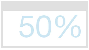
7.Big Counter
|
1 2 3 4 5 6 7 8 9 10 11 12 13 14 15 16 17 18 19 20 21 22 23 24 25 26 27 28 29 30 31 32 33 34 |
.pace { -webkit-pointer-events: none; pointer-events: none; -webkit-user-select: none; -moz-user-select: none; user-select: none; } .pace.pace-inactive .pace-progress { display: none; } .pace .pace-progress { position: fixed; z-index: 2000; top: 0; right: 0; height: 5rem; width: 5rem; } .pace .pace-progress:after { display: block; position: absolute; top: 0; right: .5rem; content: attr(data-progress-text); font-family: "Helvetica Neue", sans-serif; font-weight: 100; font-size: 5rem; line-height: 1; text-align: right; color: rgba(0, 128, 192, 0.19999999999999996); } |
8.Corner Indicator

|
1 2 3 4 5 6 7 8 9 10 11 12 13 14 15 16 17 18 19 20 21 22 23 24 25 26 27 28 29 30 31 32 33 34 35 36 37 38 39 40 41 42 43 44 45 46 47 48 49 50 51 52 53 54 55 56 57 58 59 60 61 62 63 64 65 66 67 68 69 |
.pace { -webkit-pointer-events: none; pointer-events: none; -webkit-user-select: none; -moz-user-select: none; user-select: none; } .pace .pace-activity { display: block; position: fixed; z-index: 2000; top: 0; right: 0; width: 300px; height: 300px; background: #0080c0; -webkit-transition: -webkit-transform 0.3s; transition: transform 0.3s; -webkit-transform: translateX(100%) translateY(-100%) rotate(45deg); transform: translateX(100%) translateY(-100%) rotate(45deg); pointer-events: none; } .pace.pace-active .pace-activity { -webkit-transform: translateX(50%) translateY(-50%) rotate(45deg); transform: translateX(50%) translateY(-50%) rotate(45deg); } .pace .pace-activity::before, .pace .pace-activity::after { position: absolute; bottom: 30px; left: 50%; display: block; border: 5px solid #fff; border-radius: 50%; content: ''; } .pace .pace-activity::before { margin-left: -40px; width: 80px; height: 80px; border-right-color: rgba(0, 0, 0, .2); border-left-color: rgba(0, 0, 0, .2); -webkit-animation: pace-rotation 3s linear infinite; animation: pace-rotation 3s linear infinite; } .pace .pace-activity::after { bottom: 50px; margin-left: -20px; width: 40px; height: 40px; border-top-color: rgba(0, 0, 0, .2); border-bottom-color: rgba(0, 0, 0, .2); -webkit-animation: pace-rotation 1s linear infinite; animation: pace-rotation 1s linear infinite; } @-webkit-keyframes pace-rotation { 0% { -webkit-transform: rotate(0deg); } 100% { -webkit-transform: rotate(359deg); } } @keyframes pace-rotation { 0% { transform: rotate(0deg); } 100% { transform: rotate(359deg); } } |
9.Bounce

|
1 2 3 4 5 6 7 8 9 10 11 12 13 14 15 16 17 18 19 20 21 22 23 24 25 26 27 28 29 30 31 32 33 34 35 36 37 38 39 40 41 42 43 44 45 46 47 48 49 50 51 52 53 54 55 56 57 58 59 60 61 62 63 64 65 66 67 68 69 70 71 72 73 74 75 76 77 78 79 80 81 82 83 84 85 86 87 88 89 90 91 92 93 94 95 96 97 98 99 100 101 102 103 104 105 106 107 108 109 110 111 112 113 114 115 116 117 118 119 120 121 122 123 124 125 126 127 128 129 130 131 132 133 134 135 136 137 138 139 140 141 142 143 144 145 146 147 148 149 150 151 152 153 154 155 156 157 158 159 160 161 162 163 164 165 166 167 168 169 170 171 172 173 174 175 176 177 178 179 180 181 182 183 184 185 186 187 188 189 190 191 192 193 194 195 196 197 198 199 200 201 202 203 204 205 206 207 208 209 210 211 212 213 214 215 216 217 218 219 220 221 222 223 224 225 226 227 228 229 230 |
.pace { width: 140px; height: 300px; position: fixed; top: -90px; right: -20px; z-index: 2000; -webkit-transform: scale(0); -moz-transform: scale(0); -ms-transform: scale(0); -o-transform: scale(0); transform: scale(0); opacity: 0; -webkit-transition: all 2s linear 0s; -moz-transition: all 2s linear 0s; transition: all 2s linear 0s; } .pace.pace-active { -webkit-transform: scale(.25); -moz-transform: scale(.25); -ms-transform: scale(.25); -o-transform: scale(.25); transform: scale(.25); opacity: 1; } .pace .pace-activity { width: 140px; height: 140px; border-radius: 70px; background: #0080c0; position: absolute; top: 0; z-index: 1911; -webkit-animation: pace-bounce 1s infinite; -moz-animation: pace-bounce 1s infinite; -o-animation: pace-bounce 1s infinite; -ms-animation: pace-bounce 1s infinite; animation: pace-bounce 1s infinite; } .pace .pace-progress { position: absolute; display: block; left: 50%; bottom: 0; z-index: 1910; margin-left: -30px; width: 60px; height: 75px; background: rgba(20, 20, 20, .1); box-shadow: 0 0 20px 35px rgba(20, 20, 20, .1); border-radius: 30px / 40px; -webkit-transform: scaleY(.3); -moz-transform: scaleY(.3); -ms-transform: scaleY(.3); -o-transform: scaleY(.3); transform: scaleY(.3); -webkit-animation: pace-compress .5s infinite alternate; -moz-animation: pace-compress .5s infinite alternate; -o-animation: pace-compress .5s infinite alternate; -ms-animation: pace-compress .5s infinite alternate; animation: pace-compress .5s infinite alternate; } @-webkit-keyframes pace-bounce { 0% { top: 0; -webkit-animation-timing-function: ease-in; } 40% {} 50% { top: 140px; height: 140px; -webkit-animation-timing-function: ease-out; } 55% { top: 160px; height: 120px; border-radius: 70px / 60px; -webkit-animation-timing-function: ease-in; } 65% { top: 120px; height: 140px; border-radius: 70px; -webkit-animation-timing-function: ease-out; } 95% { top: 0; -webkit-animation-timing-function: ease-in; } 100% { top: 0; -webkit-animation-timing-function: ease-in; } } @-moz-keyframes pace-bounce { 0% { top: 0; -moz-animation-timing-function: ease-in; } 40% {} 50% { top: 140px; height: 140px; -moz-animation-timing-function: ease-out; } 55% { top: 160px; height: 120px; border-radius: 70px / 60px; -moz-animation-timing-function: ease-in; } 65% { top: 120px; height: 140px; border-radius: 70px; -moz-animation-timing-function: ease-out;} 95% { top: 0; -moz-animation-timing-function: ease-in; } 100% {top: 0; -moz-animation-timing-function: ease-in; } } @keyframes pace-bounce { 0% { top: 0; animation-timing-function: ease-in; } 50% { top: 140px; height: 140px; animation-timing-function: ease-out; } 55% { top: 160px; height: 120px; border-radius: 70px / 60px; animation-timing-function: ease-in; } 65% { top: 120px; height: 140px; border-radius: 70px; animation-timing-function: ease-out; } 95% { top: 0; animation-timing-function: ease-in; } 100% { top: 0; animation-timing-function: ease-in; } } @-webkit-keyframes pace-compress { 0% { bottom: 0; margin-left: -30px; width: 60px; height: 75px; background: rgba(20, 20, 20, .1); box-shadow: 0 0 20px 35px rgba(20, 20, 20, .1); border-radius: 30px / 40px; -webkit-animation-timing-function: ease-in; } 100% { bottom: 30px; margin-left: -10px; width: 20px; height: 5px; background: rgba(20, 20, 20, .3); box-shadow: 0 0 20px 35px rgba(20, 20, 20, .3); border-radius: 20px / 20px; -webkit-animation-timing-function: ease-out; } } @-moz-keyframes pace-compress { 0% { bottom: 0; margin-left: -30px; width: 60px; height: 75px; background: rgba(20, 20, 20, .1); box-shadow: 0 0 20px 35px rgba(20, 20, 20, .1); border-radius: 30px / 40px; -moz-animation-timing-function: ease-in; } 100% { bottom: 30px; margin-left: -10px; width: 20px; height: 5px; background: rgba(20, 20, 20, .3); box-shadow: 0 0 20px 35px rgba(20, 20, 20, .3); border-radius: 20px / 20px; -moz-animation-timing-function: ease-out; } } @keyframes pace-compress { 0% { bottom: 0; margin-left: -30px; width: 60px; height: 75px; background: rgba(20, 20, 20, .1); box-shadow: 0 0 20px 35px rgba(20, 20, 20, .1); border-radius: 30px / 40px; animation-timing-function: ease-in; } 100% { bottom: 30px; margin-left: -10px; width: 20px; height: 5px; background: rgba(20, 20, 20, .3); box-shadow: 0 0 20px 35px rgba(20, 20, 20, .3); border-radius: 20px / 20px; animation-timing-function: ease-out; } } |
10.Loading Bar

|
1 2 3 4 5 6 7 8 9 10 11 12 13 14 15 16 17 18 19 20 21 22 23 24 25 26 27 28 29 30 31 32 33 34 35 36 37 38 39 40 41 42 43 44 45 46 47 48 49 50 51 52 53 54 55 56 57 58 59 60 61 62 63 64 65 66 67 68 69 70 71 72 73 74 75 76 77 78 79 80 81 82 |
.pace { -webkit-box-sizing: border-box; -moz-box-sizing: border-box; -ms-box-sizing: border-box; -o-box-sizing: border-box; box-sizing: border-box; -webkit-border-radius: 10px; -moz-border-radius: 10px; border-radius: 10px; -moz-background-clip: padding; -webkit-background-clip: padding-box; background-clip: padding-box; -webkit-pointer-events: none; pointer-events: none; -webkit-user-select: none; -moz-user-select: none; user-select: none; z-index: 2000; position: fixed; margin: auto; top: 12px; left: 0; right: 0; bottom: 0; width: 200px; height: 25px; border: 2px solid #0080c0; background-color: #fff; } .pace .pace-progress { -webkit-box-sizing: border-box; -moz-box-sizing: border-box; -ms-box-sizing: border-box; -o-box-sizing: border-box; box-sizing: border-box; -webkit-border-radius: 5px; -moz-border-radius: 5px; border-radius: 5px; -webkit-background-clip: padding-box; -moz-background-clip: padding; background-clip: padding-box; -webkit-transition: width 1s ease-in-out 1s linear; -moz-transition: width 1s ease-in-out 1s linear; -ms-transition: width 1s ease-in-out 1s linear; -o-transition: width 1s ease-in-out 1s linear; transition: width 1s ease-in-out 1s linear; -webkit-transform: translate3d(0, 0, 0); transform: translate3d(0, 0, 0); max-width: 190px; position: fixed; z-index: 2000; display: block; position: absolute; left: 3px; top: 3px; height: 15px; font-size: 12px; background: #0080c0; color: #0080c0; line-height: 60px; font-weight: bold; font-family: Helvetica, Arial, "Lucida Grande", sans-serif; } .pace .pace-progress:after { content: attr(data-progress-text); display: inline-block; } .pace.pace-inactive { display: none; } |
11.Center Circle

|
1 2 3 4 5 6 7 8 9 10 11 12 13 14 15 16 17 18 19 20 21 22 23 24 25 26 27 28 29 30 31 32 33 34 35 36 37 38 39 40 41 42 43 44 45 46 47 48 49 50 51 52 53 54 55 56 57 58 59 60 61 62 63 64 65 66 67 68 69 70 71 72 73 74 75 76 77 78 79 80 81 82 83 84 85 86 87 88 89 90 91 92 93 94 95 96 97 98 99 100 101 102 103 104 105 106 107 108 109 |
.pace { -webkit-pointer-events: none; pointer-events: none; -webkit-user-select: none; -moz-user-select: none; user-select: none; -webkit-perspective: 12rem; -moz-perspective: 12rem; -ms-perspective: 12rem; -o-perspective: 12rem; perspective: 12rem; z-index: 2000; position: fixed; height: 6rem; width: 6rem; margin: auto; top: 0; left: 0; right: 0; bottom: 0; } .pace.pace-inactive .pace-progress { display: none; } .pace .pace-progress { position: fixed; z-index: 2000; display: block; position: absolute; left: 0; top: 0; height: 6rem; width: 6rem !important; line-height: 6rem; font-size: 2rem; border-radius: 50%; background: rgba(0, 128, 192, 0.8); color: #fff; font-family: "Helvetica Neue", sans-serif; font-weight: 100; text-align: center; -webkit-animation: pace-3d-spinner linear infinite 2s; -moz-animation: pace-3d-spinner linear infinite 2s; -ms-animation: pace-3d-spinner linear infinite 2s; -o-animation: pace-3d-spinner linear infinite 2s; animation: pace-3d-spinner linear infinite 2s; -webkit-transform-style: preserve-3d; -moz-transform-style: preserve-3d; -ms-transform-style: preserve-3d; -o-transform-style: preserve-3d; transform-style: preserve-3d; } .pace .pace-progress:after { content: attr(data-progress-text); display: block; } @-webkit-keyframes pace-3d-spinner { from { -webkit-transform: rotateY(0deg); } to { -webkit-transform: rotateY(360deg); } } @-moz-keyframes pace-3d-spinner { from { -moz-transform: rotateY(0deg); } to { -moz-transform: rotateY(360deg); } } @-ms-keyframes pace-3d-spinner { from { -ms-transform: rotateY(0deg); } to { -ms-transform: rotateY(360deg); } } @-o-keyframes pace-3d-spinner { from { -o-transform: rotateY(0deg); } to { -o-transform: rotateY(360deg); } } @keyframes pace-3d-spinner { from { transform: rotateY(0deg); } to { transform: rotateY(360deg); } } |
12.Center Atom

|
1 2 3 4 5 6 7 8 9 10 11 12 13 14 15 16 17 18 19 20 21 22 23 24 25 26 27 28 29 30 31 32 33 34 35 36 37 38 39 40 41 42 43 44 45 46 47 48 49 50 51 52 53 54 55 56 57 58 59 60 61 62 63 64 65 66 67 68 69 70 71 72 73 74 75 76 77 78 79 80 81 82 83 84 85 86 87 88 89 90 91 92 93 94 95 96 97 98 99 100 101 102 103 104 105 106 107 108 109 110 111 112 113 114 115 116 117 118 119 120 121 122 123 124 125 126 127 128 129 130 131 132 133 134 135 136 137 138 139 140 141 142 143 144 145 146 147 148 149 150 151 152 153 154 155 156 157 158 159 160 161 162 163 164 165 166 167 168 169 |
.pace.pace-inactive { display: none; } .pace { -webkit-pointer-events: none; pointer-events: none; -webkit-user-select: none; -moz-user-select: none; user-select: none; z-index: 2000; position: fixed; height: 60px; width: 100px; margin: auto; top: 0; left: 0; right: 0; bottom: 0; } .pace .pace-progress { z-index: 2000; position: absolute; height: 60px; width: 100px !important; } .pace .pace-progress:before { content: attr(data-progress-text); text-align: center; color: #fff; background: #0080c0; border-radius: 50%; font-family: "Helvetica Neue", sans-serif; font-size: 14px; font-weight: 100; line-height: 1; padding: 20% 0 7px; width: 50%; height: 40%; margin: 10px 0 0 30px; display: block; z-index: 999; position: absolute; } .pace .pace-progress:after { border-radius: 50%; border: 5px solid #0080c0; content: ' '; display: block; position: absolute; top: 0; left: 0; height: 60px; width: 100px; -webkit-transform: rotate(90deg); -moz-transform: rotate(90deg); -o-transform: rotate(90deg); transform: rotate(90deg); -webkit-animation: spin-3 2s linear infinite; -moz-animation: spin-3 2s linear infinite; -o-animation: spin-3 2s linear infinite; animation: spin-3 2s linear infinite; } .pace .pace-activity { font-size: 15px; line-height: 1; z-index: 2000; position: absolute; height: 60px; width: 100px; display: block; } .pace .pace-activity:before { border-radius: 50%; border: 5px solid #0080c0; content: ' '; display: block; position: absolute; top: 0; left: 0; height: 60px; width: 100px; -webkit-animation: spin-1 2s linear infinite; -moz-animation: spin-1 2s linear infinite; -o-animation: spin-1 2s linear infinite; animation: spin-1 2s linear infinite; } .pace .pace-activity:after{ border-radius: 50%; border: 5px solid #0080c0; content: ' '; display: block; position: absolute; top: 0; left: 0; height: 60px; width: 100px; -webkit-transform: rotate(45deg); -moz-transform: rotate(45deg); -o-transform: rotate(45deg); transform: rotate(45deg); -webkit-animation: spin-2 2s linear infinite; -moz-animation: spin-2 2s linear infinite; -o-animation: spin-2 2s linear infinite; animation: spin-2 2s linear infinite; } @-webkit-keyframes spin-1 { 0% { -webkit-transform: rotate(0deg); } 100%{ -webkit-transform: rotate(359deg);} } @-moz-keyframes spin-1 { 0% { -moz-transform: rotate(0deg); } 100%{ -moz-transform: rotate(359deg);} } @-o-keyframes spin-1 { 0% { -o-transform: rotate(0deg); } 100%{ -o-transform: rotate(359deg);} } @keyframes spin-1 { 0% { transform: rotate(0deg); } 100%{ transform: rotate(359deg);} } @-webkit-keyframes spin-2 { 0% { -webkit-transform: rotate(59.8deg); } 100%{ -webkit-transform: rotate(418.8deg);} } @-moz-keyframes spin-2 { 0% { -moz-transform: rotate(59.8deg); } 100%{ -moz-transform: rotate(418.8deg);} } @-o-keyframes spin-2 { 0% { -o-transform: rotate(59.8deg); } 100%{ -o-transform: rotate(418.8deg);} } @keyframes spin-2 { 0% { transform: rotate(59.8deg); } 100%{ transform: rotate(418.8deg);} } @-webkit-keyframes spin-3 { 0% { -webkit-transform: rotate(119.6deg); } 100%{ -webkit-transform: rotate(478.6deg);} } @-moz-keyframes spin-3 { 0% { -moz-transform: rotate(119.6deg); } 100%{ -moz-transform: rotate(478.6deg);} } @-o-keyframes spin-3 { 0% { -o-transform: rotate(119.6deg); } 100%{ -o-transform: rotate(478.6deg);} } @keyframes spin-3 { 0% { transform: rotate(119.6deg); } 100%{ transform: rotate(478.6deg);} } |
13.Center Radar

|
1 2 3 4 5 6 7 8 9 10 11 12 13 14 15 16 17 18 19 20 21 22 23 24 25 26 27 28 29 30 31 32 33 34 35 36 37 38 39 40 41 42 43 44 45 46 47 48 49 50 51 52 53 54 55 56 57 58 59 60 61 62 63 64 65 66 67 68 69 |
.pace { -webkit-pointer-events: none; pointer-events: none; z-index: 2000; position: fixed; height: 90px; width: 90px; margin: auto; top: 0; left: 0; right: 0; bottom: 0; } .pace.pace-inactive .pace-activity { display: none; } .pace .pace-activity { position: fixed; z-index: 2000; display: block; position: absolute; left: -30px; top: -30px; height: 90px; width: 90px; display: block; border-width: 30px; border-style: double; border-color: #0080c0 transparent transparent; border-radius: 50%; -webkit-animation: spin 1s linear infinite; -moz-animation: spin 1s linear infinite; -o-animation: spin 1s linear infinite; animation: spin 1s linear infinite; } .pace .pace-activity:before { content: ' '; position: absolute; top: 10px; left: 10px; height: 50px; width: 50px; display: block; border-width: 10px; border-style: solid; border-color: #0080c0 transparent transparent; border-radius: 50%; } @-webkit-keyframes spin { 100% { -webkit-transform: rotate(359deg); } } @-moz-keyframes spin { 100% { -moz-transform: rotate(359deg); } } @-o-keyframes spin { 100% { -moz-transform: rotate(359deg); } } @keyframes spin { 100% { transform: rotate(359deg); } } |
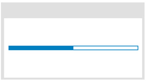
14.Center Simple
|
1 2 3 4 5 6 7 8 9 10 11 12 13 14 15 16 17 18 19 20 21 22 23 24 25 26 27 28 29 30 31 32 33 34 35 36 37 38 39 40 41 42 43 44 45 46 47 48 49 50 51 52 53 |
.pace { -webkit-pointer-events: none; pointer-events: none; -webkit-user-select: none; -moz-user-select: none; user-select: none; z-index: 2000; position: fixed; margin: auto; top: 0; left: 0; right: 0; bottom: 0; height: 5px; width: 200px; background: #fff; border: 1px solid #0080c0; } .pace .pace-progress { -webkit-box-sizing: border-box; -moz-box-sizing: border-box; -ms-box-sizing: border-box; -o-box-sizing: border-box; box-sizing: border-box; -webkit-transition: width 1s ease-in-out 1s linear; -moz-transition: width 1s ease-in-out 1s linear; -ms-transition: width 1s ease-in-out 1s linear; -o-transition: width 1s ease-in-out 1s linear; transition: width 1s ease-in-out 1s linear; -webkit-transform: translate3d(0, 0, 0); -moz-transform: translate3d(0, 0, 0); -ms-transform: translate3d(0, 0, 0); -o-transform: translate3d(0, 0, 0); transform: translate3d(0, 0, 0); max-width: 200px; position: fixed; z-index: 2000; display: block; position: absolute; left: 0px; top: 0px; height: 100%; background: #0080c0; } .pace.pace-inactive { display: none; } |
以上になります。